Energy monitoring in buildings

Electricity use in a building changes with the weather, operating hours and the activities taking place inside. This article looks at how a model can help distinguish those patterns from unusual changes in consumption.
One useful distinction is between baseload, the electricity demand that remains outside normal operating hours, and the additional demand during working hours.
The examples use simulated data. Get in touch if you’d like to know more.
The approach uses a parametric model, with parameters describing a building’s baseload, operating hours and response to temperature. This makes it possible to examine how electricity use varies with operating hours and outdoor temperature, and identify changes in baseload.
Separating the load
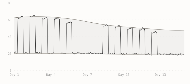
The starting point is two curves through the hourly readings. The lower curve estimates baseload; the upper curve follows demand during busier periods. These are the lower and upper envelopes. Here, upper load means the upper reference curve, rather than the highest individual reading.
The chart below shows both curves alongside two weeks of readings. Separating these levels helps show whether demand is rising overnight as well as during the day, or mainly during working hours. A daily total can hide that difference.
Writing demand as Yt, baseload as Bt and upper load as Ut, relative activity is:
This gives a measure of relative activity: near zero, demand is close to baseload; near one, it is close to upper load. It describes the reading’s position between the curves, rather than counting people or machines in use. Readings can fall outside this range.
The curves show changes in electricity use, but not what caused them. To investigate, we would need readings from individual meters or records of what was running at the time.
Temperature response
Where heating uses electricity, colder weather can raise demand. The model accounts for this before looking for unusual changes. Buildings retain heat, so demand may respond to a change in weather over several hours. Using smoothed outdoor temperature allows for that delay.
The model relates baseload and upper load to temperature separately. The baseload relationship is a straight line. For upper load, an extra heating term applies below a temperature threshold: the colder it gets, the more demand this term adds. This is change-point regression.
Here, T̃ is smoothed outdoor temperature and τ is the heating threshold. The intercepts set the straight-line parts of the model; the slopes describe how those parts change with temperature. Below τ, the heating term adds demand as the temperature falls.
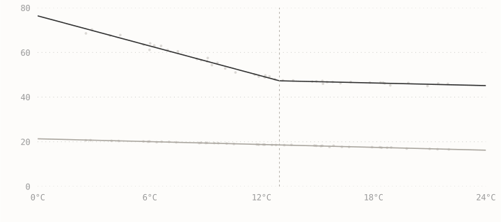
The fitted heating threshold here is 12.9°C. Below it, each 1°C fall in outdoor temperature adds about 2.2 kW to the upper load. Both values come from the simulated example.
Seasonal activity
A building can have a busy season as well as a working week. If production or occupancy rises at the same time each year, temperature alone will not explain its electricity use. The expected demand needs to allow for that activity.
Here, I simulate a busy season from June to August. Both models are fitted to the first year; the plot shows the second. One uses temperature alone. The other also includes the busy season from an operating calendar.
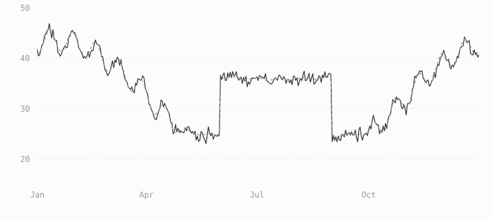
Including the busy season accounts for the extra summer demand.
The seasonal model allows for about 12 kW of extra demand during the busy months. The weather-only model misses this summer increase. Including the operating calendar helps distinguish a recurring busy period from an unexpected rise in demand.
Reading a change
Expected demand combines the estimated baseload, upper load and relative activity for each hour. Comparing it with the reading shows how much demand is above or below what the model expects.
The hats indicate model estimates: expected baseload plus expected activity multiplied by the gap to upper load.
In the examples below, I keep the fitted model fixed and change one thing at a time, so the effect of each change is easier to see. Colder weather raises the demand the model expects. An extra load running all week also raises consumption at night. Longer operating hours extend the daily peaks.
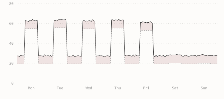
An extra 8 kW runs throughout the week. Demand stays elevated overnight and through the weekend, adding 1,344 kWh before measurement noise.
The same model is used for all three cases. Changing one condition at a time makes it easier to see why demand rises and whether the model accounts for it.
What remains unexplained
Subtract expected demand from the reading and we get a residual. Zero means the reading matches the estimate. A positive value means demand was higher than expected; a negative value means it was lower.
This is the same week as above, with the same selected change. In the colder-weather example, measured and expected demand rise together, so the residual stays near zero. Extra baseload leaves a difference throughout the week; longer hours leave peaks after the expected closing time.
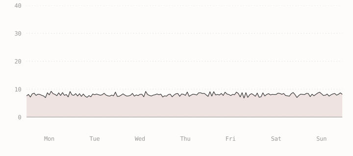
Higher baseload leaves a difference of about 8 kW, day and night.
The size, timing and duration of these differences help identify changes worth investigating. A difference that persists every night deserves a closer look than an isolated reading.
In action
A change in electricity use gives you somewhere to start looking. If demand rises overnight, has something been left running? If the daily peaks last longer, have operating hours changed? Looking at the readings alongside the weather and building’s schedule can help explain what happened.
The next step is to compare these patterns with maintenance records and known problems. That would help show which changes are worth flagging and whether the model flags them early enough to act.
With monitoring in place, you can catch problems earlier, reduce wasted energy and keep buildings running more smoothly.